Choosing the perfect Dulux White for your interior

Are you building or renovating? Do you have nightmares whenever you think about selecting a white paint for your interior? Do you find yourself asking “why are there SO MANY white paints?”. Then this might be the blog for you :-)
As some of you might know, my family and I recently moved back to Australia after 5 years living in Jakarta, Indonesia. Before we left Australia in 2019, we completed a major renovation and extension to our home but never lived in it - instead a lovely family of 4 moved in and rented to the house from us. As fate would have it - just as we discovered we were moving home to Perth, they purchased their first house. Brilliant timing!
With a large shipping container on its way, and life really busy as we settled back into Australia, we didn’t have much time to overthink moving back into our home. However, one thing we knew we wanted to do was to repaint the interiors - a quick and easy way to give the house a bit of a pick-me-up.
Queue most people’s worse nightmare, but one of my favourite things to do - paint selections!
When choosing the perfect interior white, there are a few things worth considering:
How would you describe the overall style of your home?
How much light does each room receive?
What style of furniture and wall-art do you plan to incorporate?
In my case, the answers were:
Exterior: 1980s brick and tile, with a slight Federation-style; Interior: Modern design but with significant use of French windows.
Reasonable level of light, particularly in front bedrooms and back living spaces.
A combination of French Farmhouse, with a big dollap of Indonesian colour and style - something I now refer to as Tropical Farmhouse.
As you might be aware, not all whites are the same - in fact, whites can be grouped by their ‘temperature’.
Cool whites tend to have a blue/grey undertone and can look great in modern homes or where lighting is good. Unfortunately though, the blue undertone also means that they can look quite cold in certain light and so are not favoured if you want to introduce some warmth to your home.
Warm whites tend have a yellow or pink undertone and look more ‘old-fashioned’. They work beautifully in older style homes but can look a little pink or mustardy depending on lighting.
In my case, I couldn’t decide if I wanted to embrace the modern or more traditional look. So, I headed to Bunnings Warehouse (if you know, you know) and decided pretty quickly to focus on Dulux which seems to be preferred by most professional painters and in my experience represents good value for money.
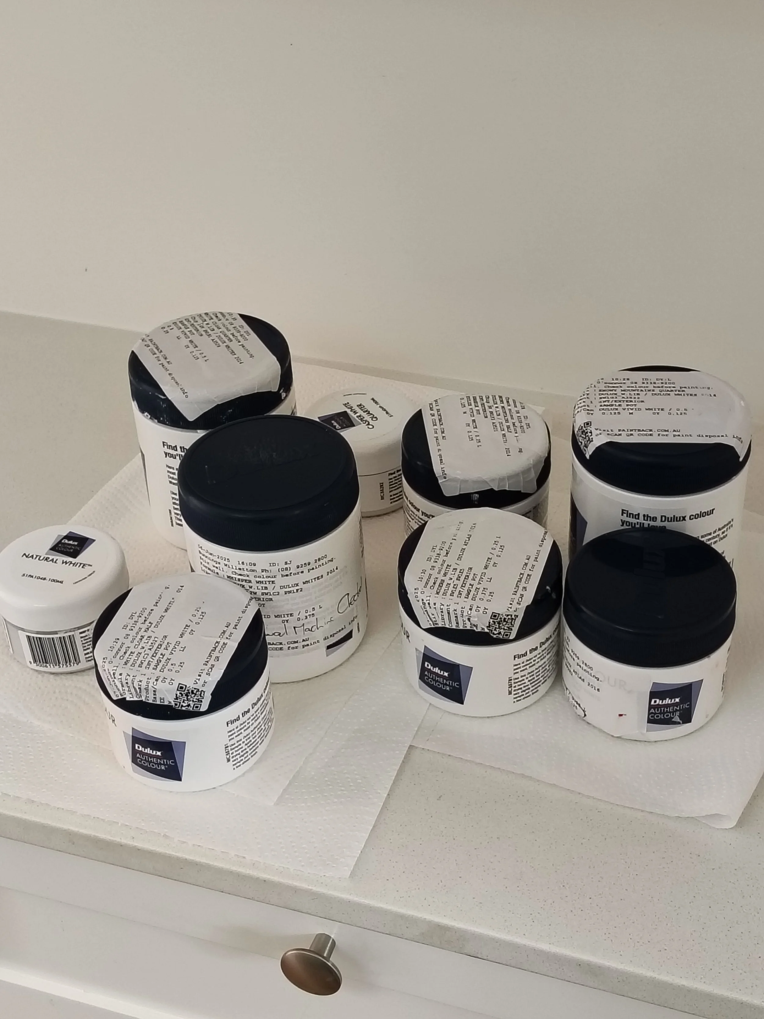
Because I like to cover all my bases, I selected QUITE A FEW sample pots. These included:
Dulux Whisper White
Dulux Casper White Half
Dulux Casper White Quarter
Dulux Natural White
Dulux Modern White
Dulux Rottnest Island
Dulux White Cloak Quarter
Dulux White Cloak Half
Dulux Snowy Mountains Quarter
Dulux Snowy Mountains Half
Dulux Snowy Mountains.


Can you spot the differences? Dulux Lexicon Quarter, Natural White, Vivid White, Casper White Half, Natural White
Phew, that is a lot of options! As one of my old economics lecturers once spoke of, this might just be an example of “confuse-opoly” ;-). I had already ruled out Dulux Vivid White and Dulux Lexicon as they are too bright and harsh for me.
Because light can be different in different locations and change throughout the day, I painted samples across the house and looked at them both in the morning and later in the day.


I pretty quickly ruled out Rottnest Island (too dark), Modern White (too pink), White Cloak Half (a little too sandy). I also ruled out Snowy Mountains Quarter, Natural White and Casper White Quarter for being too white and cold. The last one was a surprise to me - several years ago I used Casper White Quarter to paint the exterior of a house I was asked to work on by a Western Australian builder (link here). In that case, the colour looked amazing. However, as I say, age, style and access to light can make a huge impact on colour. So, this left me with White Cloak Quarter and Snowy Mountains Half.
However, the more I looked at these two, the more I felt they didn’t quite hit the mark. Then I remembered an old favourite that I had used on a rental home many years ago - Snowy Moutains (full). A reasonably new colour to the Dulux range, this colour was suggested to me by a painter and I fell in love with it immediately. A creamy but still quite light white, in my opinion it looks great in both modern and older homes. To my eye, it has the ever-so-slight green undertone, although I can find no information to confirm this. And because I particularly like decorating with green, Snowy Mountain is a brilliant option.

Dulux Snowy Mountains
Walls painted in Snowy Mountain provide a subtle but obvious contrast against ceiling white. If you want to also have some level of contrast with doors and doorframes, I suggest selecting Dulux Snowy Mountain Quarter or Half for the doors and frames, quarter being a bolder contrast than half. Alternatively, doors and doorframes can be painted Vivid White for a more obvious and crisper contrast with the walls.
So what did I make the correct decision? I think so, but you tell me :-)


Dulux Snowy Mountain in my home, as seen from various rooms in my house.