2024 Colours of the Year
As an interior decorator, this is one of the most anticipated times of the year.
The time when all the major international paint companies put out their much anticipated Colours of the Year (Colors of the Year for my American readers!).
What I am noticing this year are more restrained colour palettes than in previous years.
Prior to Covid, the dominant colours for many years were neutrals and greys/grays. Everywhere you looked, someone was proudly telling you about the new grey colour they had just painted their rooms in.
Then Covid struck and we were all stuck in our homes. While there, we realised that neutral and grey can be boring. We wanted more colour; we wanted to feel warm and cocooned in our homes.
As a result, over the last few years I would argue that we have seen a return to warmer, bolder colours, with green being a particularly popular colour. Clearly we were all trying to bring the outdoors inside, since we couldn’t go outside very often!
So it is interesting to see that this year there has been a shift away from this theme, particularly in the US market, where blues and cooler colours seem to be making a comeback of sorts.
That is not to say that we are returning to grey. Definitely not, based on what I can see. But I think that perhaps in 2024 we are a little less likely to embrace bold colours, as we look to make our homes feel cooler and more elegant than was the case when we lived in them 24/7.
Read on and let me know your thoughts.
Dulux
Dulux doesn’t tend to release a single colour of the year, but instead releases a small number of ranges.
This year their 2024 forecast ranges include: Solstice; Journey; and Muse.
Solstice
Described by Dulux as inspired by the pared-back Scandanavian approach, it also incorporates the warmth of the Meditteranean and the desert. As a result, the range brings together both warm colours as well as cooler accent colours.
Journey
Journey on the otherhand, is more vibrant and is inspired by travel and and traditions. The colours include burgandy, muted sea greens, blues and softened yellows and golds. They lend themselves to statement rooms and more classical homes.
Muse
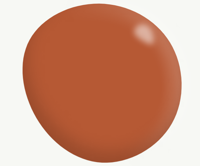
The Muse range is not the feint-hearted and includes bold colours such as sea greens, saturated blues and even bold terracotta colours. As with the Journey palette, these are colours that demand attention and won’t be hidden away.
Pantone
As you may or may not know, Pantone is a true leader in the world of colour and its application. Colour of The Year selections are greatly anticipated and set trends not just in home decor, but the fashion world for the coming year.
Pantone also has a habit of leaving its reveal until the very end of the year. So it was very exciting last week to finally see the big reveal.
And it is a colour that I am personally very excited about!
Peach Fuzz!
A gorgeous orange-pink pastel shade, this takes me back to my youth and time spent rummaging through magazines trying to imagine my perfect house once I moved out of home.
Ironically, by the time I did move out, these pastelly colours were definitely on the outs.
However, as I approach a big birthday and reflect on my life to date, I love seeing colours of my youth making a comeback. Woohoo!
A velvet soft and warm colour, it can be used on walls, on furniture or as a dash of subtle colour in a more neutral room.
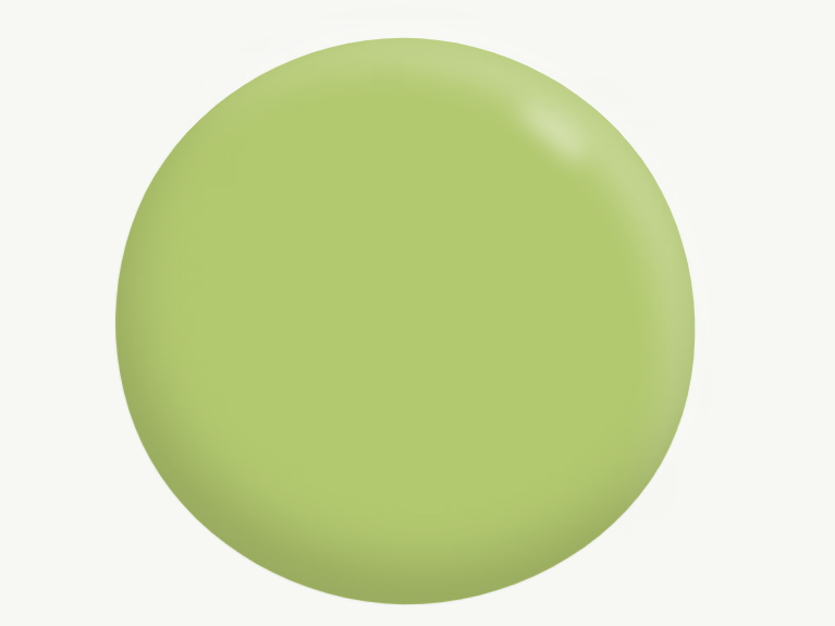
For a real splash, partner with a burnt orange and a lime green or more muted green. Amazing! Or for the really bold, partner Peach Fuzz against a charcoal background!
Sherwin Williams
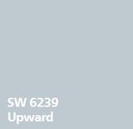
Over at Sherwin Williams, and the recently announced colour of the year is Upward, a relaxed and breezy light blue, with just a hint of silver.
In keeping with what is a clear return to pastels and muted colours, this colour will breathe life into any room that you colour with it. It is both light and uplifting.
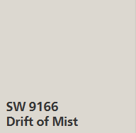
Upward pairs beatifully with a light greige (see Drift of Mist by Sherwin Williams).
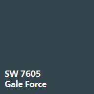
Upwards also works well with a darker navy-inspired blue (try Gale Force by Sherwin Williams) for a monochromatic look.
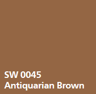
For some beautiful contrast that adds an immediate pop of class and elegance, contrast with a browny-gold colour such as Antiquarian Brown (also Sherwin Williams).
Benjamin Moore
Keeping with the Blue theme, Benjamin Moore recently announced Blue Nova as it’s Color of the Year for 2024.
A darker blue, with hints of violet, it continues the trend we have seen in recent years towards colours that have a chalky quality to them.
An opportunity to play with colour without saturating your home in bright colours, Blue Nova is both modern and classical and works well with either a more feminine or masculine feel.
Contrast it with neutrals and whites for a more coastal or Hamptons look. Alternatively, apply the colour chart rules I have blogged about previously, to really make a room pop.
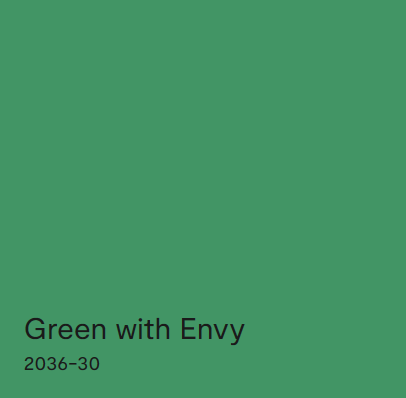
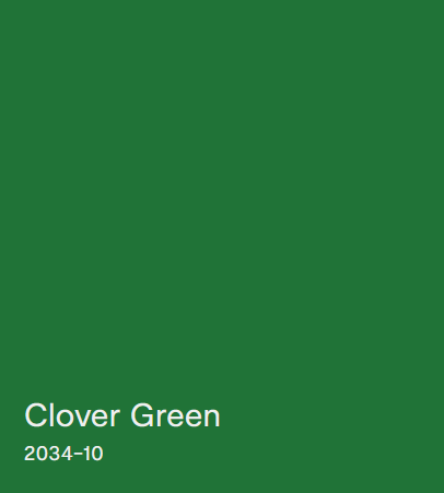
Some great combinations with Blue Nova include muted and burnt oranges, such as Topaz (also from Benjamin Moore) or a fresh green such as Clover Green or Green With Envy (also from Benjamin Moore).
Let me know what you think of these new colours of the year, and of course, get in touch if you have any questions about how to use colour in your own home. I can be contacted here.
