2023 Colour of the Year
It’s that time of the year, when all the major paint stores release their Colour Of The Year predictions and inspire us all with ideas of using our Christmas break to do some painting and updating in our homes. If not now, then when ;-)
Why do colour predictions matter? Well, they are both a reflection of and prediction of modern society. Colour impacts us all. Some colours make us feel calm, some make us feel bold and others provide a sense of warmth and comfort.
Pre-Covid, there was a definite trend in recent years towards neutrals, whites and greys. Greys were everywhere and seemed to reflect a cool minimalistic approach to how we lived. Perhaps a reaction to the excesses of the 1980s, the idea was to treat the home as a pared back canvas.
However, Covid seems to have accelerated what was already starting to occur. People grew tired of more sterile looking homes - indeed, given the events of the last 3 years, is it any wonder that people simply became tired of staring at white or grey walls and furnishings?
So what are the predictions for this year?
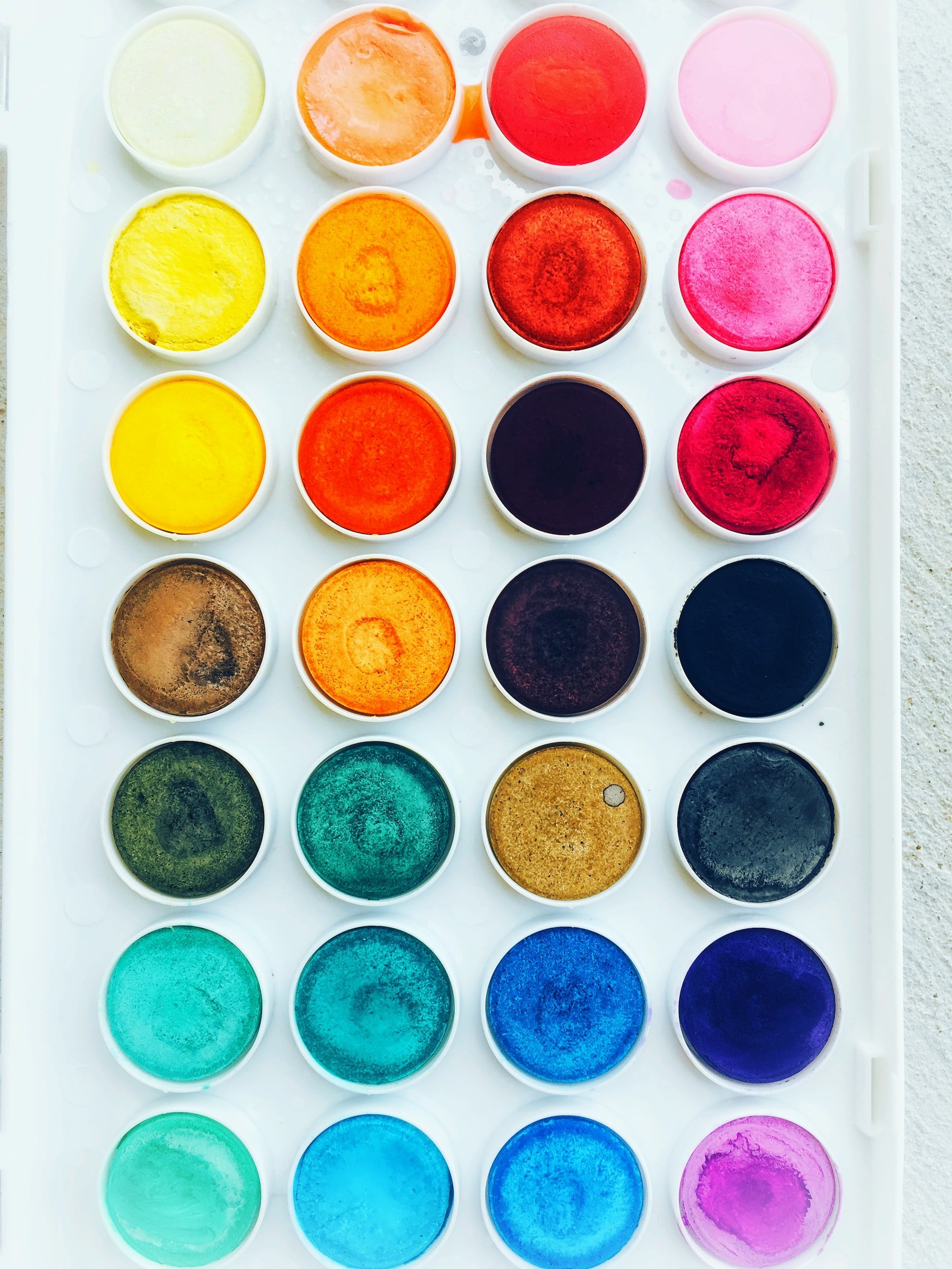
Well, in keeping with recent posts, there continues to be a focus on colour, with many of the main paint manufacturers identifying bold, often jewel coloured hues (think blues, greens as well as well as some pink-based browns). While these are not typically colours that you would paint your whole home in, some feature walls and well placed soft furnishings in these colours will automatically lift your home and provide an interesting visual aesthetic for visitors to your home. Also, it seems to be the case that many of these colours have chalky tints, adding to both a sense of old-world charm and also creating a softer, warmer look to any home.
Pantone

Digital Lavender
This year Pantone has selected a lavender colour, Digital Lavender. After selecting a more vivid purple colour for 2022 (Very Peri), this gorgeous shade affects the senses in multiple ways.
On the one hand, the colour itself speaks to a sense of calm and peacefulness.
That makes this the perfect colour for bedrooms or rooms designated for relaxation - think home spas (if you are lucky enough to have one!), nurseries or even a guest bedroom.
On the other hand, this is an immensely positive and optimistic colour, also making it perfect for a teenagers bedroom.
Sherwin Williams

Sherwin Williams has selected a mid-range neutral for Colour of the Year 2023. Redend Point is a lovely combination of beige and blush, with pink undertones.
Adding warmth to any room, it is particularly fantastic for living rooms and bedrooms, where it is a more colourful (but still restrained) option to whites and creams.
The colour speaks to the outdoors and adds some depth to any room in which it is used. Unlike some other colours of the year, it is subtle enough to not overwhelm a room if applied across all walls.
Benjamin Moore

Raspberry Blush
As with the Pantone Selection, Benjamin Moore’s 2023 Colour of the Year is one of joy and boldness. Selecting Raspberry Blush, this saturated red-orange colour is a bold choice and one that elevates any room in which it is used.
For those a little frightened of over-using this shade, I would recommend using it as an accent colour. Working beautifully in a dining room or formal lounge, this coral colour will have your friends talking.
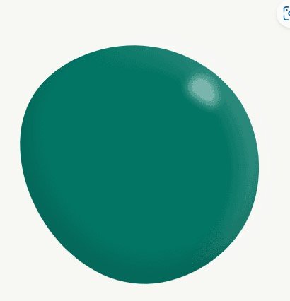
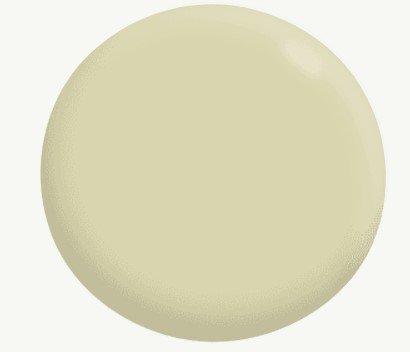
Glidden

Vining Ivy
Easily my favourite colour of the year prediction, Glidden’s Vining Ivy is that delicious blend of green and blue that I love. Not too bright to appear gaudy, not so dark that you are reminded of a stormy sky, this colour is a refined by emotive blend of blue and green.
Described as both energizing and grounding, it is an incredibly versatile paint colour that would work in almost any room, and once again speaks to that need we seem to have post-Covid to favour colours that encourage harmony and tranquility.
When paired with wood and other natural materials, this colour creates a connection to nature. Paired with golden and bold accents, and you have a touch of glam.
Dulux
Unlike many other paint makers, Dulux does not select a single colour but instead a swathe of colours along three themes - Balance, Connect and Revive.
While the Balance colours focus on moody blues and greens, as well as oceanic blues alongside pastels, the Connect colours are nature focussed, including earthy naturals, muted greens, and sunsetting yellows. The Revive group features soft blues and lilacs alongside emerald green and joyful yellows.
My personal favourite are:
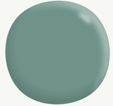
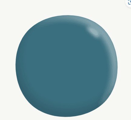
In order: Pharoah’s Gem, Nephrite, Kimberly Sea, Wasabi.
For more information on the complete range of Dulux colours of 2023, click here.
What colours are your favourite? Do you tend to use one brand over another?
Ax